Racks City
Client retainer: Jun 2022 - Nov 2024
Food & Beverage
BRAND IDENTITY
OVERVIEW
For Racks City, we led a focused brand refresh in celebration of over a decade of operations as one of Hong Kong’s defining hip hop bars. The objective was to refine and elevate the existing identity while preserving the raw, authentic energy at the core of its culture and community.
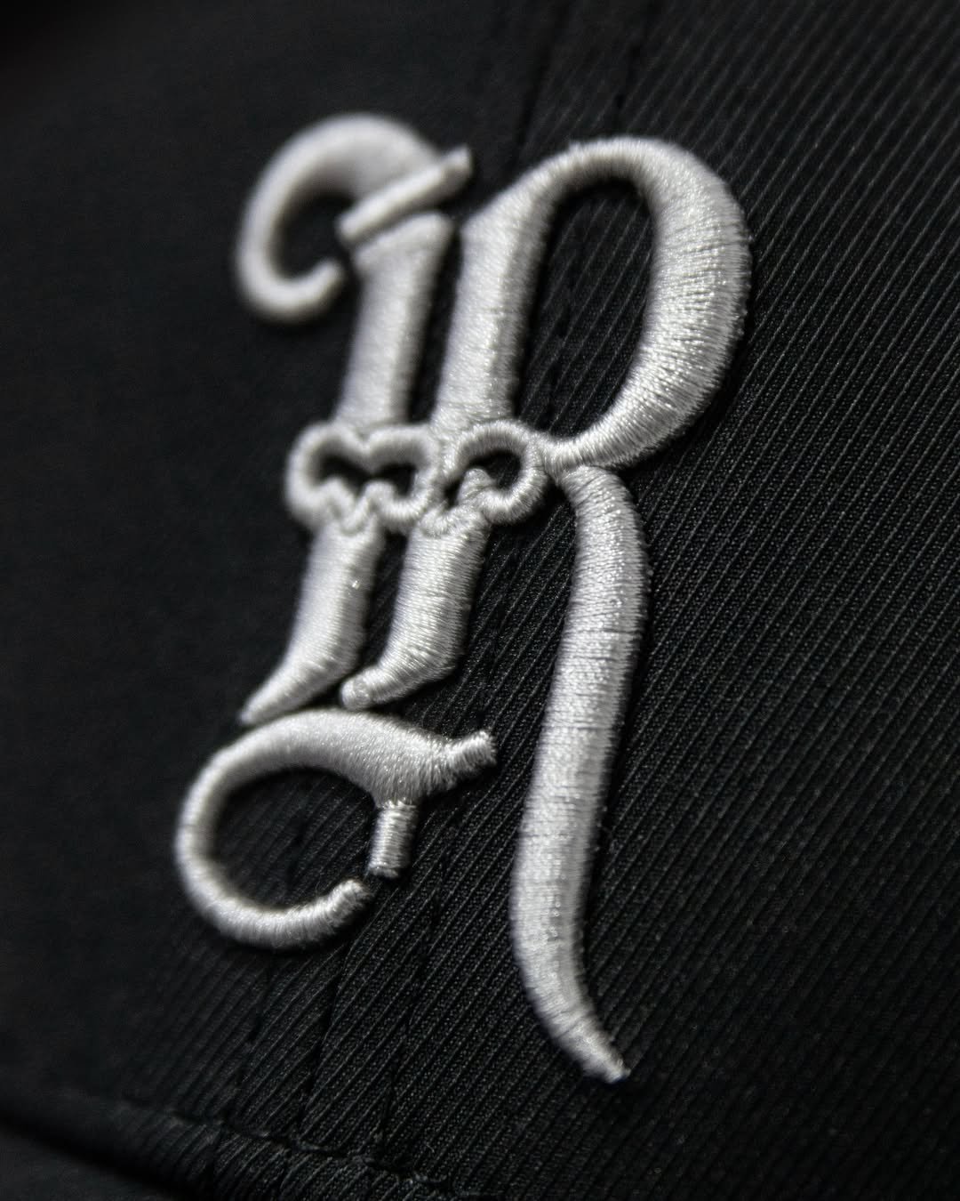
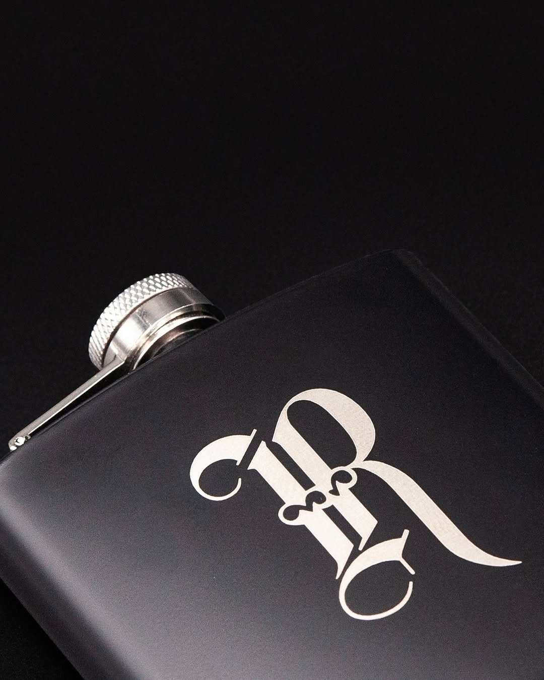
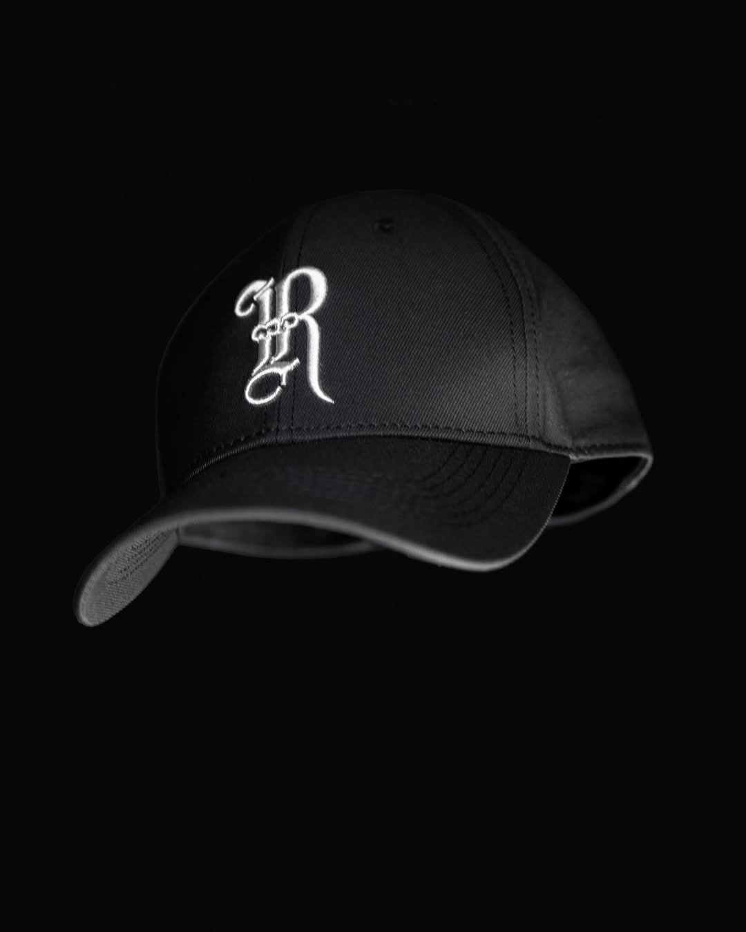
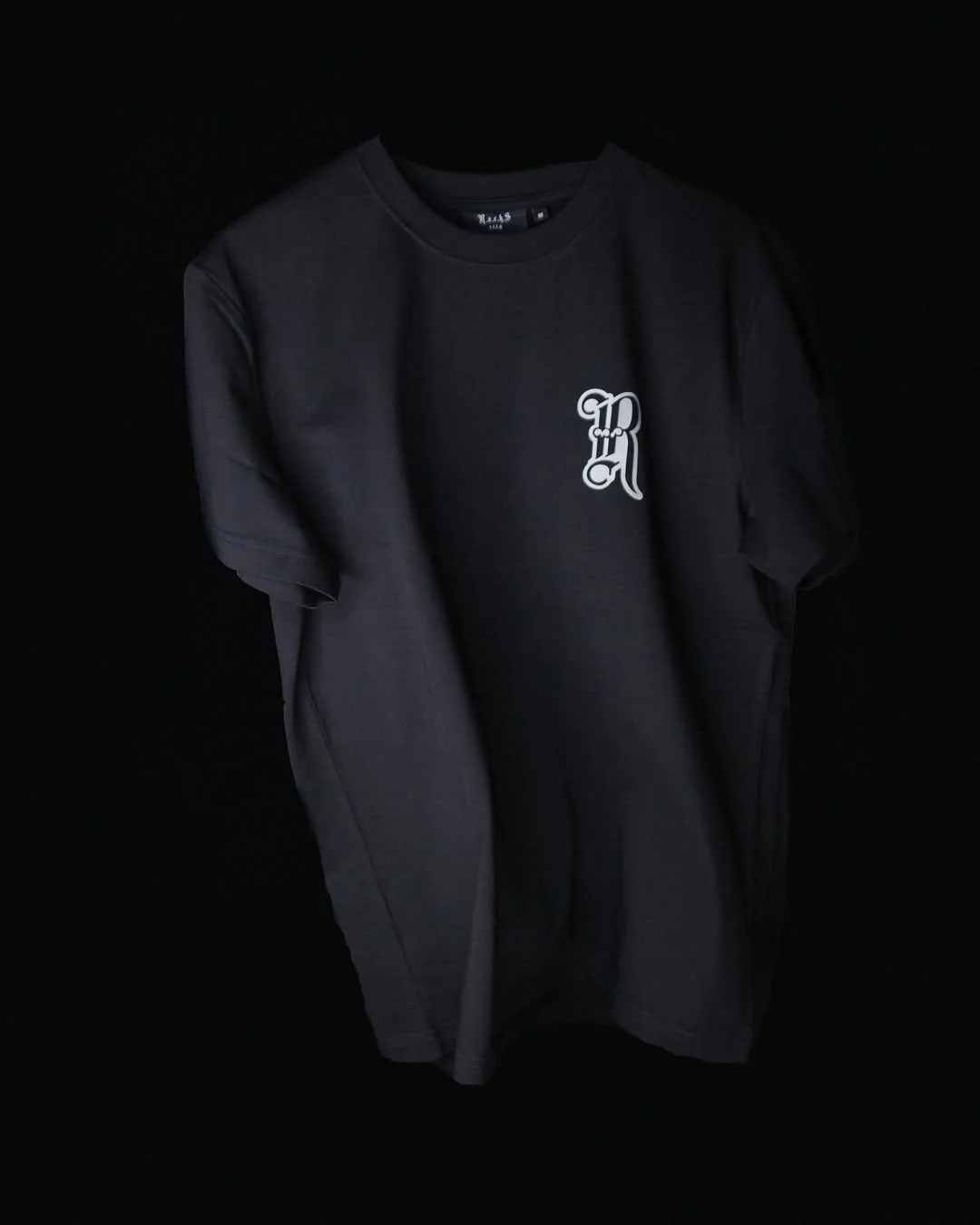
We reworked the original logo system, stripping it back to a more intentional, minimal wordmark and removing the hand drawn qualities in favour of a cleaner, more considered approach. The R was reworked as a primary graphic device, establishing a strong and recognisable symbol that could live independently across applications and extend across merchandise, stickers, and supporting brand assets to reinforce a consistent and instantly recognisable visual signature.
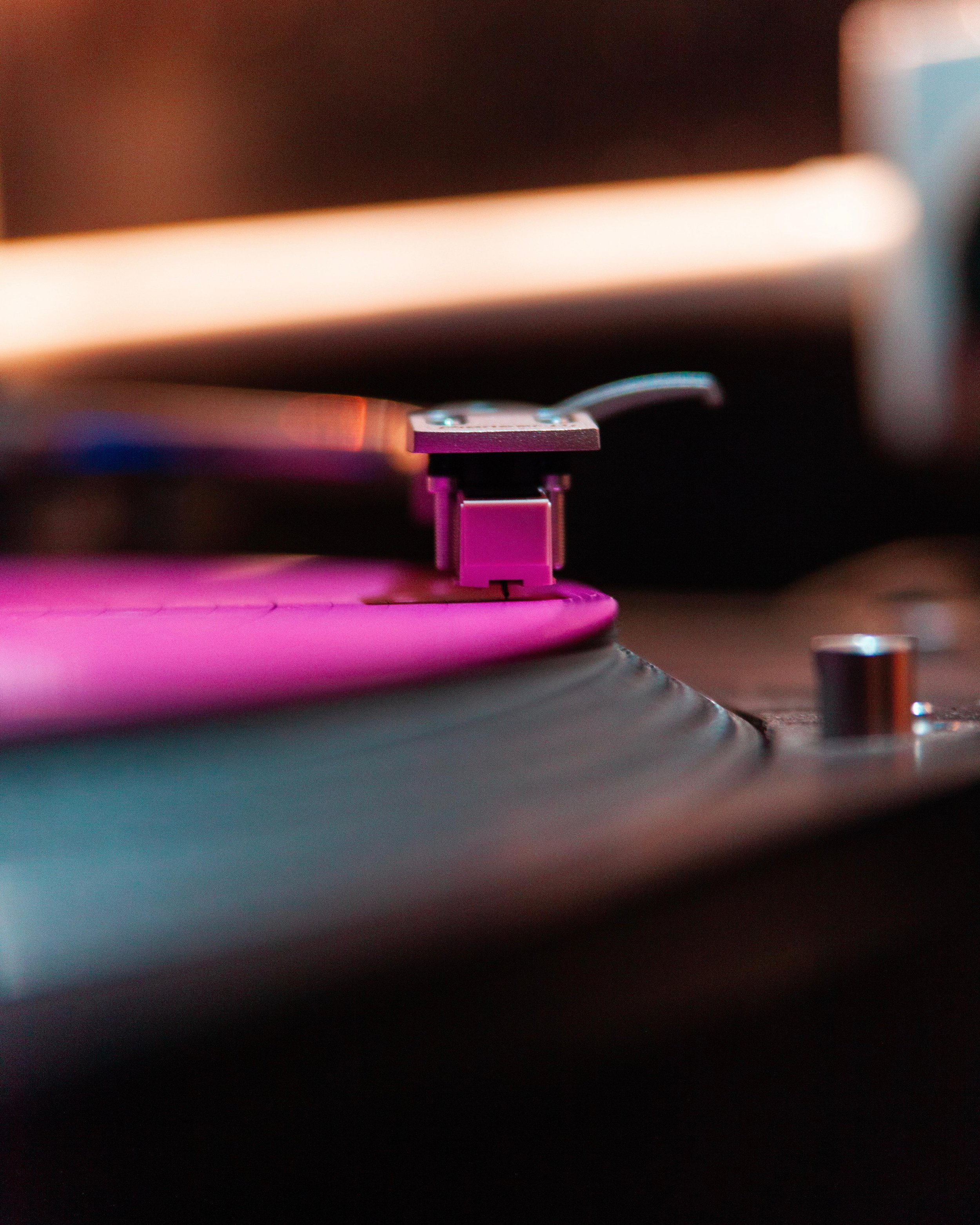
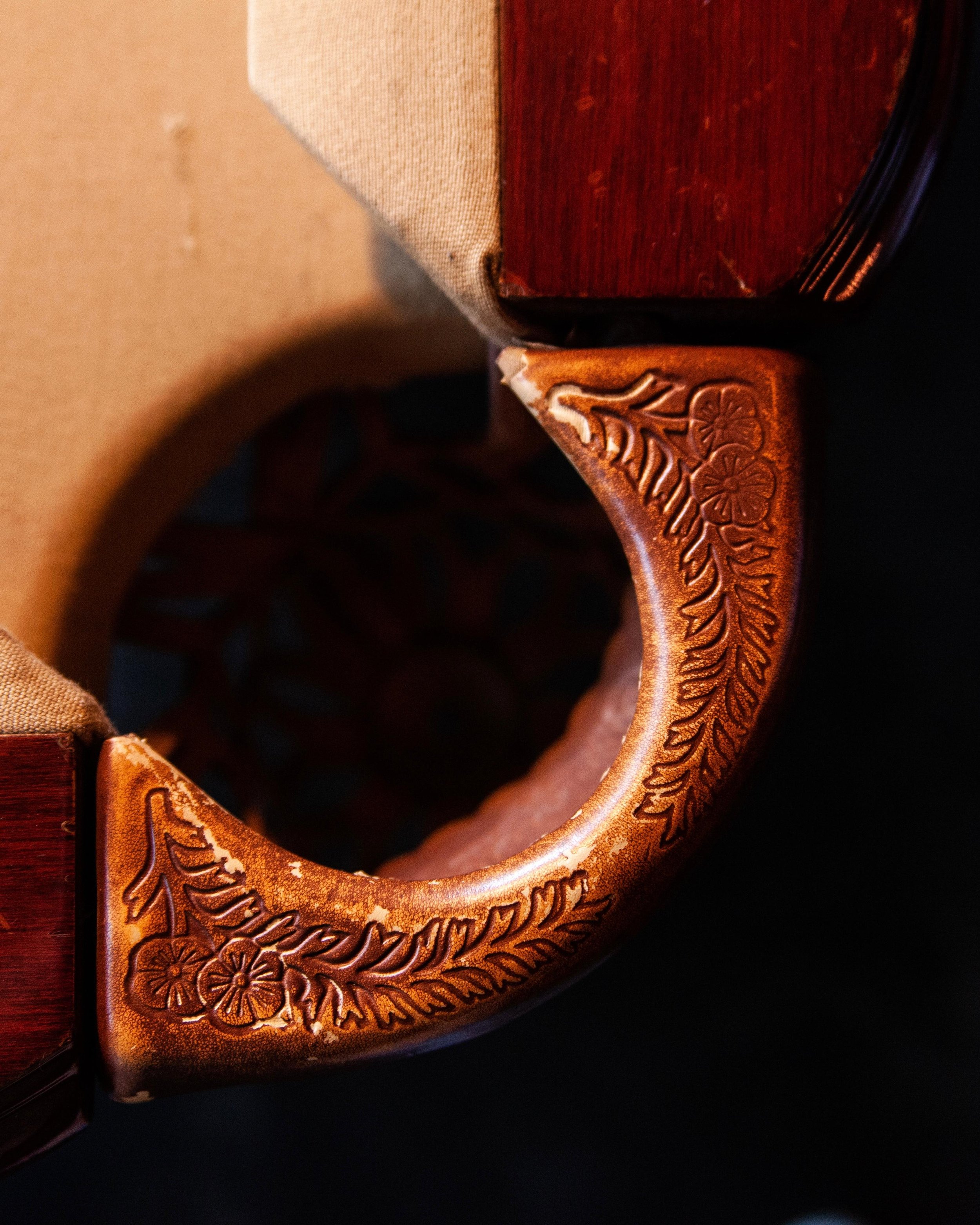
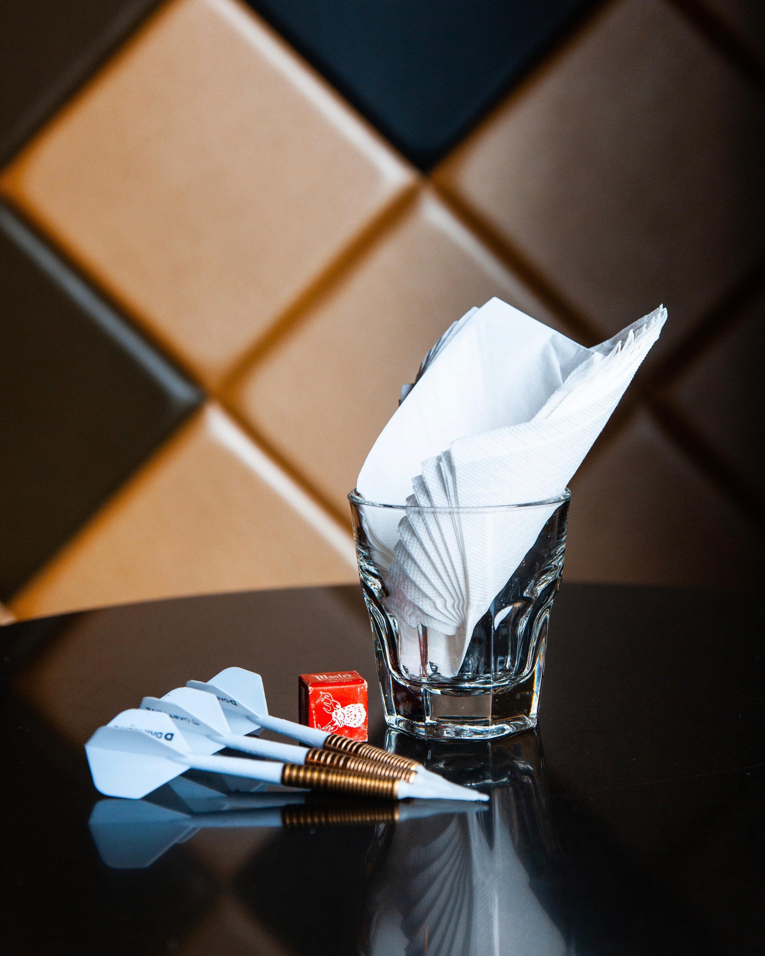
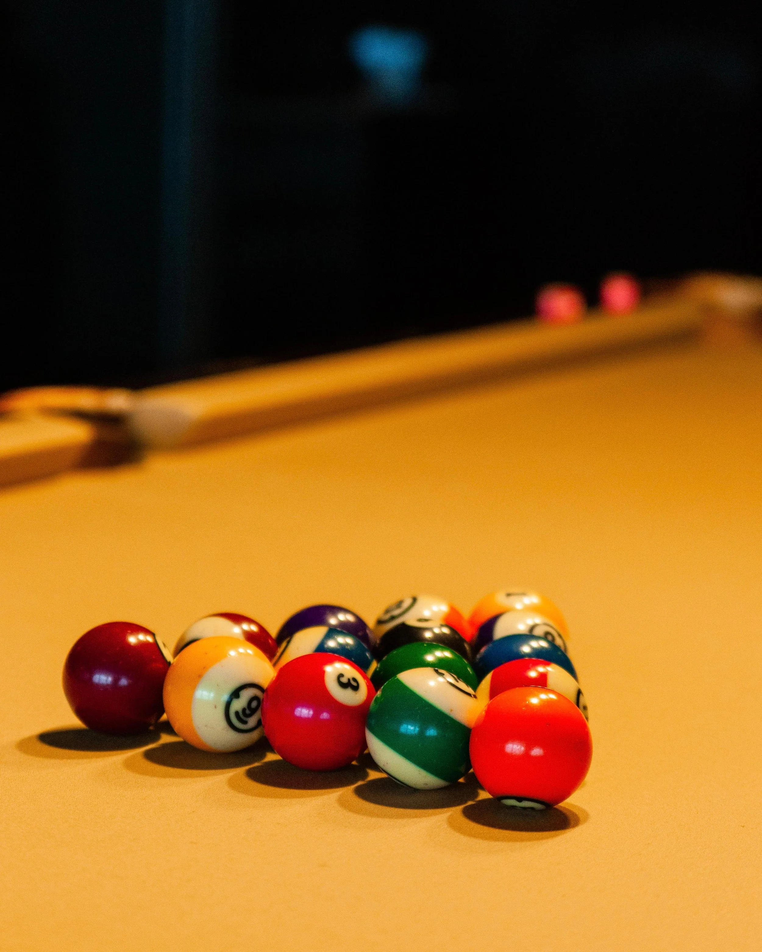
The refined identity informed a broader art direction across photography, design, and digital touchpoints. We developed a stripped back but stylish visual language, capturing the atmosphere of the space through composition, light, and texture. This was carried through into a new website designed to feel simple and intuitive, placing emphasis on detail and atmosphere.
To mark the milestone, we also developed a limited merchandise collection reflecting the bar’s evolution, balancing utility and craft through 3M printed tees, embroidered caps, and metal drinking flasks, expressing both the grit of Racks and a more mature, refined edge to its cultural presence.
Project Details
Art direction, Branding refresh, Graphic design, Website design, Photography, Social media strategy & management
Services
PHOTOGRAPHY